


Snaqies Overview
Can’t remember which food places you’ve tried? Which place offered you the best experiences and which ones offered the worst? Capture your food journey in a quick snap and keep all your dining memories in one place!
PROBLEM STATEMENT
Food enthusiasts need a new tool to organize their dining experiences, so that they can remember and make honest recommendation.
SOLUTION
Create an app tailored to organizing food dining data.
ROLES
UX Designer
React Native Developer
Agile Scrum Leader
TIMELINE
September 2023 - November 2023: MVP
November 2023 - December 2023: UX Research
April 2024 - June 2024: Design Iteration
Latest Prototype
Process
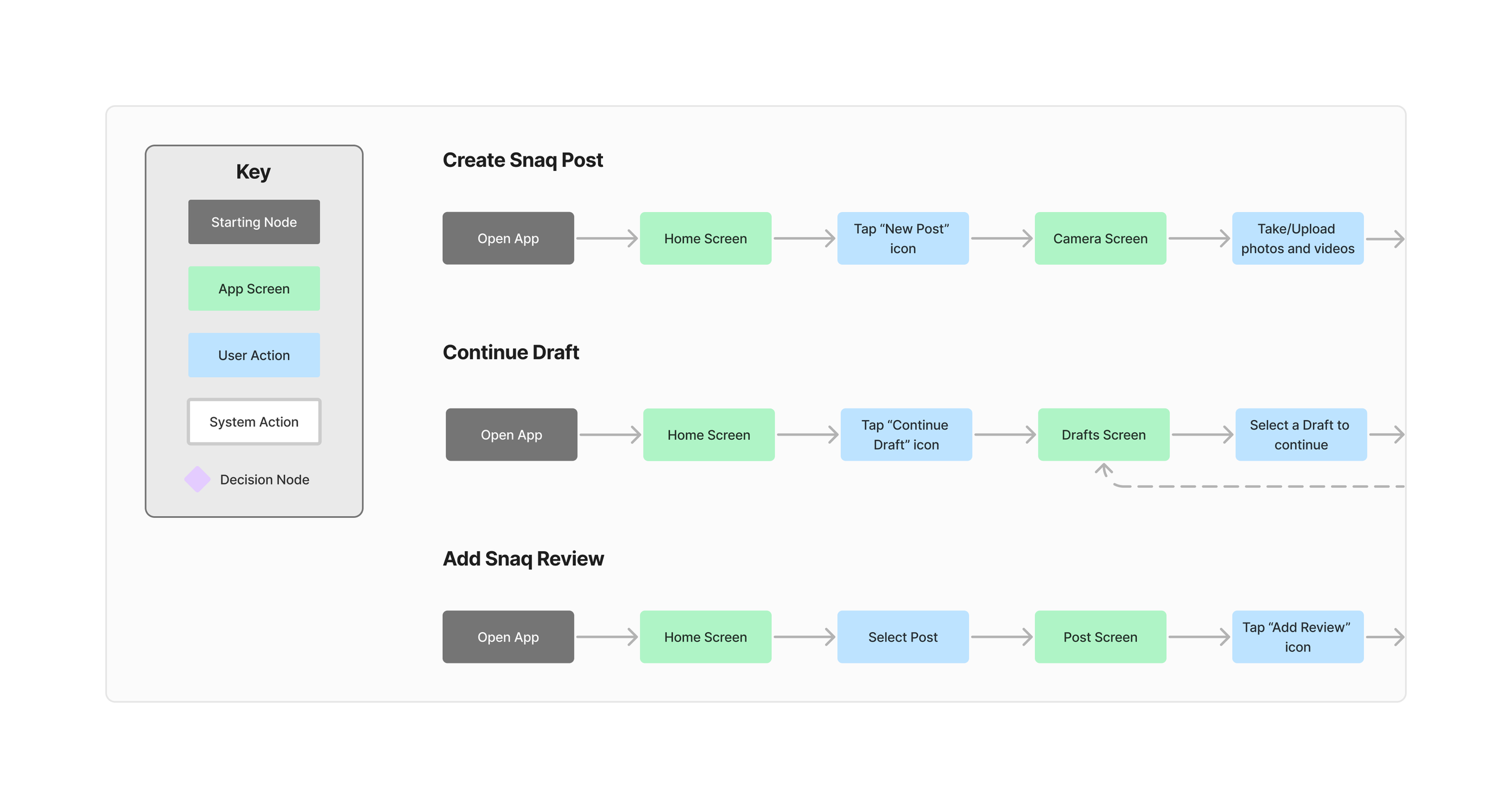
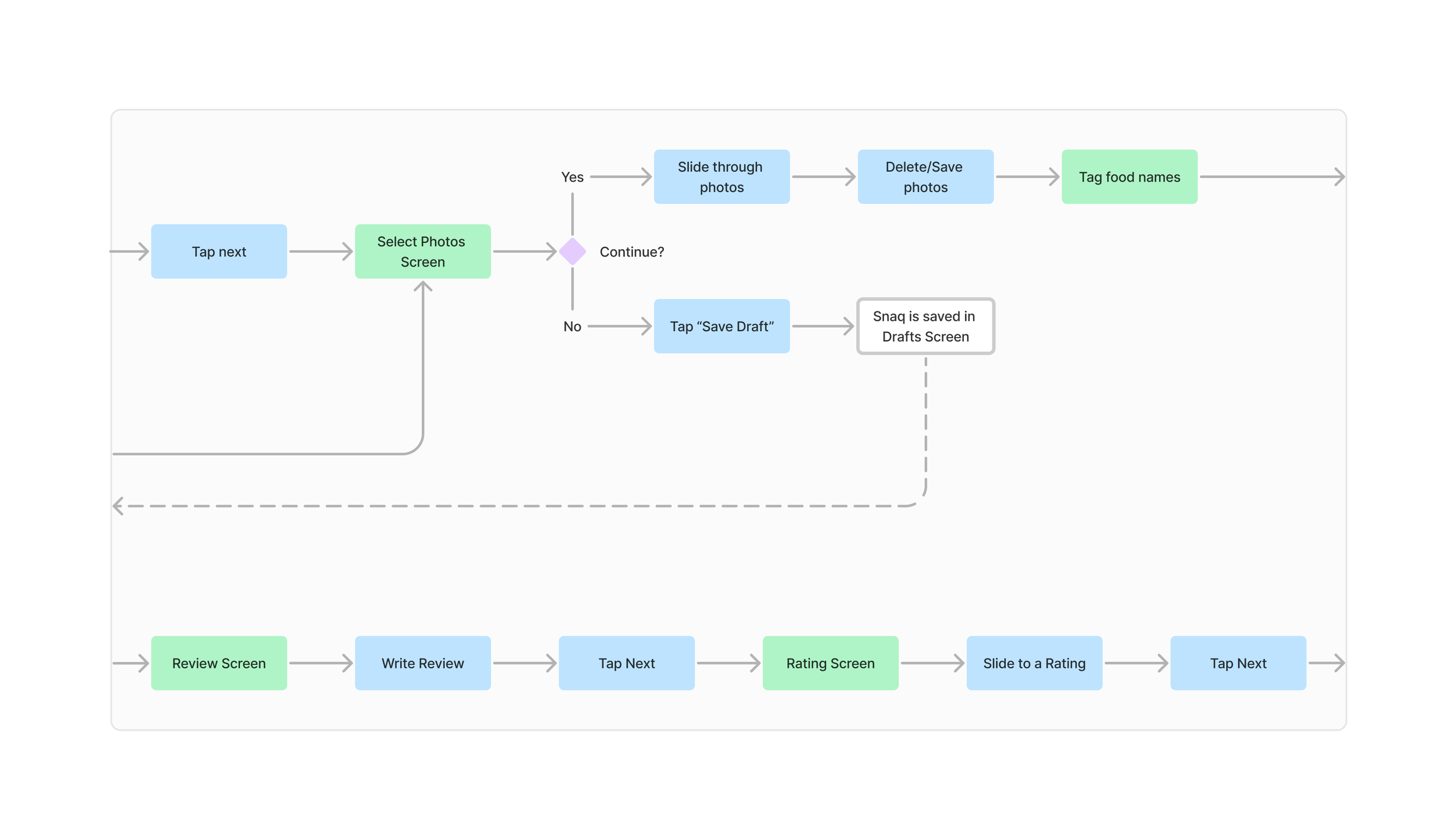
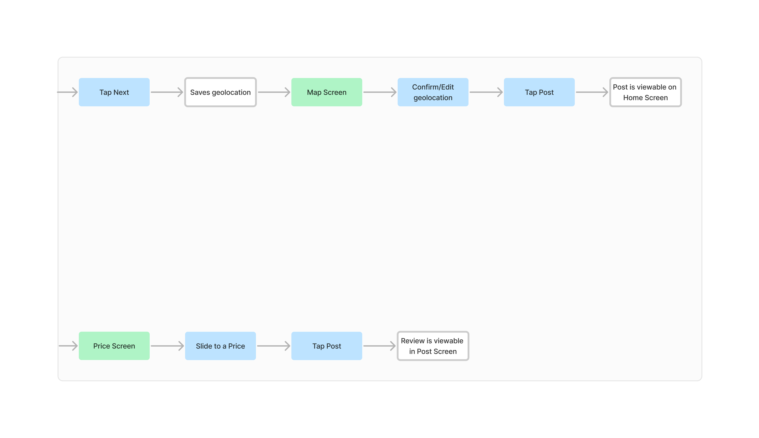
1. User Flow
2. Creating an MVP
3. UX Research
4. Design Iteration
User Flow
Key Decision #1
Navigation Types
Menu icon is not intuitive and requires users to make multiple taps instead of one, however, it saves a significant amount of screen space.
Tab bar is as intuitive as it is contemporary, requiring only one tap and being convenient for users to use their thumbs.
Top-heavy icons take up significant screen space, but paired with text-based buttons this navigation system is the most intuitive.
FINAL: Uses contemporary tab bar, but enhances usability by improving iconography, adding icon labels, and reducing the number of tabs to focus on core MVP features.
UX Research
METHOD
1-on-1 Interview & Usability Testing
DURATION
November 2023 - December 2023
PARTICIPANTS
6 food enthusiasts, ages 21-27
OBJECTIVE
Product Validation
1. People default to the most low-effort method of capturing and sharing food-related data.
Almost all participants mentioned that they take photos of their food, which requires minimal time and effort.
Many participants upload these photos to social media or share them through messages—both quick options that are soon forgotten.
2. People do high-effort things when there is an incentive.
1 participant wrote food reviews to achieve Yelp Elite status, which rewards members with free food and exclusive events.
Another participant left a review for a restaurant that offered a free dessert in exchange for a 5-star review on Google Maps.
A different participant used ratings to help remember whether they enjoyed particular boba places or not.
Design Iteration
Tagging Food Names
Low-effort way to tag food names in the 1st photo instance instead of assigning tags to each photo the food appears in
Reduces time complexity from O(n²) to O(n), meaning that instead of users taking exponential time, they take only linear time.
Viewing Post
UI no longer includes profile pictures, focusing on the solo experience instead of a social one
Version 1 has a horizontal slider for photos
Version 2.0 explored vertical scrolling, but was prone to the same tediousness
Version 2.1 uses a grid layout to save space
-
Having progressed in creating a low-effort user experience, the next step is to establish incentives for high-effort activities, such as uploading photos and writing reviews, which cannot easily simplify to become low-effort.
Efforts to develop the app have been slow but steady, and can be further improved by focusing on core MVP features.
-
This project was a valuable learning opportunity that allowed me to delve into mobile app design and development. I became familiar with various new tools, including Figma, FigJam, React Native, Expo Go, Google Maps API, and GitHub Projects.
Having taken on diverse roles in this project, I realize the importance of setting clearer expectations for myself within the team and accurately assessing my contributions to support the agile team flow and allow other team members to take on tasks effectively.
This project also emphasized my need to practice with research and data. I struggled to maintain a clear focus on a specific goal while trying to conduct both user interviews and usability testing simultaneously, which resulted in an overwhelming amount of data that was difficult to organize and analyze.