


Wedge Overview
Managing shared payments, like groceries or restaurant bills, can be awkward, confusing, and prone to error. One person usually pays the full amount, leaving the challenge of dividing costs quickly and accurately.
PROBLEM STATEMENT
Individuals who purchase on behalf of others need an easy way to budget bills accurately because current options are slow, manual, and error-prone.
SOLUTION
Use AI vision to streamline receipt and bill budgeting.
ROLES
Lead UI/UX Designer
Brand Designer
App Store Marketer
TIMELINE
Sep 2024 - Apr 2025: MVP
Apr - Aug 2025: 1st Design Iteration
Aug - Nov 2025: App Store Releases
Process
-
Identify purpose to guide design focus.
-
Map steps and key user decisions to show how a user moves through product screen and features to complete a task.
-
Incorporate brand into a curated collection of reusable components, patterns, and guidelines that ensure a product’s interface stays consistent, scalable, and efficient.
-
Design static representation to showcase detailed visual elements—such as colors, typography, and spacing—before development.
-
Observe how users interact with the product to uncover pain points, natural behaviors, and unmet needs.
-
Use feedback and data to redirect product design direction.
User Flow
Design System
User Research
METHOD
1-1 Observational Usability Test, Post-survey
RESEARCH GOALS
Obtain early feedback on product direction
Benchmark KPIs to track product growth
PARTICIPANTS
5 new users with financial means, aged 18–30.
Coded Themes and I-Statements
Product KPIs
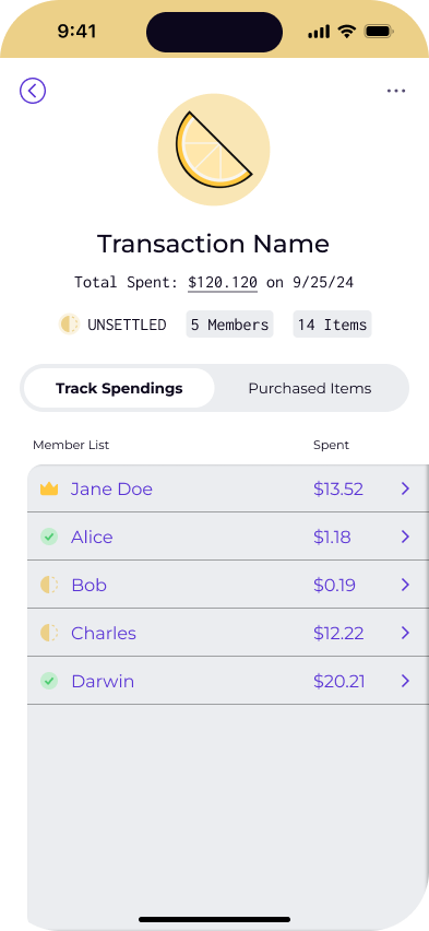
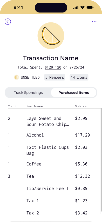
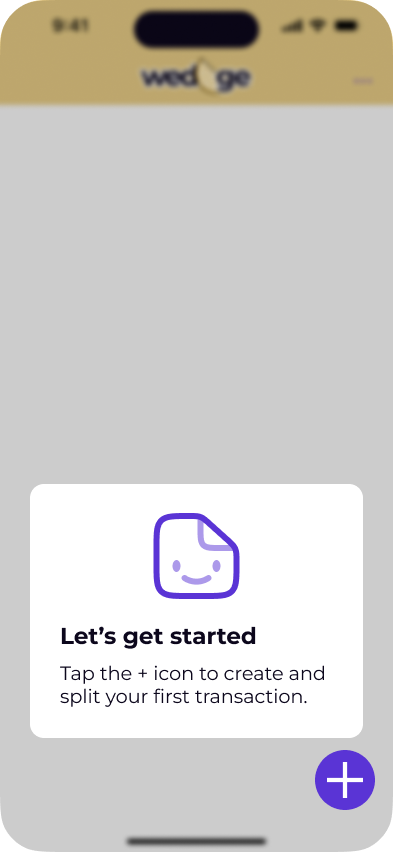
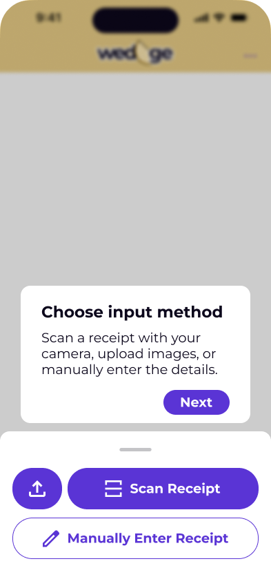
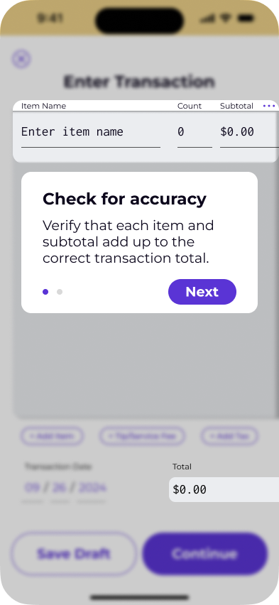
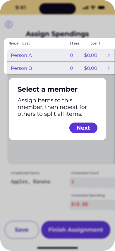
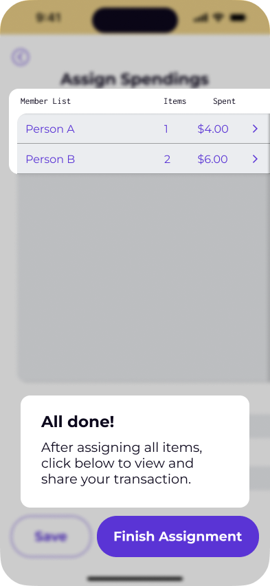
Core Flow Redesign
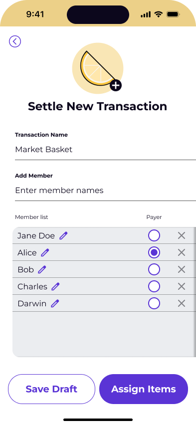
Finding 1. Users want to itemize their receipt before entering metadata
INITIAL DESIGN
Users are blocked from skipping to receipt entry because we require users to enter at least two names.
REDESIGN
Users can now choose a method of entering receipt data and do it right away, aligning with expected human use
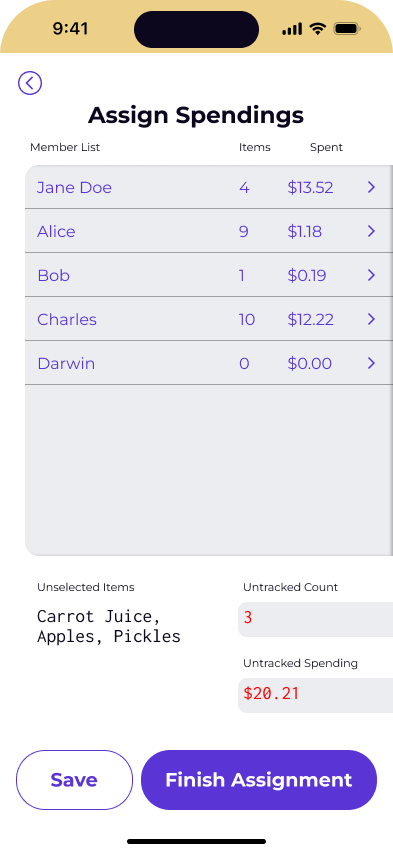
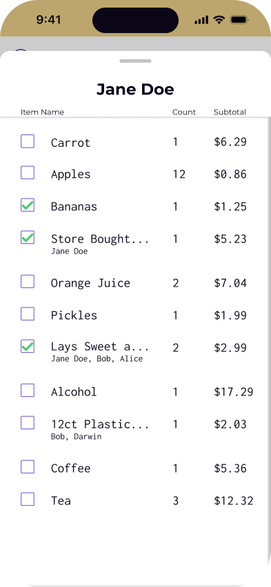
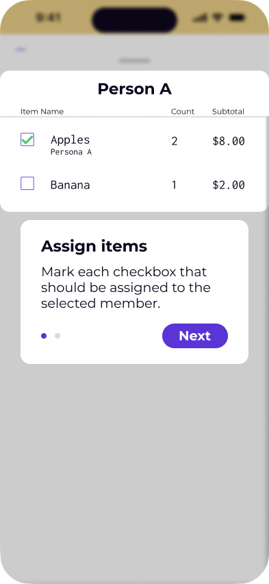
Finding 2: Users were confused about assigning items to spenders
Next Steps
Observe user tele-metrics to scale with new features and fixes
Implement External Marketing & Onboarding Tutorial
Conclusion
-
-
Leveraged AI to design and ideate a solution.
Created my own benchmarks to measure progress and reduce risk when product tele-metrics are missing.
Released my first iOS and Android app from 0, and feel confident to do it better next time.