
RightOn! Overview
Having the opportunity to visit a classroom site for interviewing, surveying, and testing, my goal was to analyze student and teacher interactions with our product and identify opportunities to enhance the learning experience.
PROBLEM
Students need more support in regards to answer explanations because foundational research shows emotional engagement and assessment outcomes depend on understanding concepts deeply, not just memorization.
HYPOTHESIS
If we design a more interactive learning experience, then students will be encouraged to engage with both correct and incorrect answer explanations.
ROLES
UX Designer
UX Researcher
CONTRIBUTORS
3 UX Designers
1 UX Lead
DURATION
March 2025 - September 2025
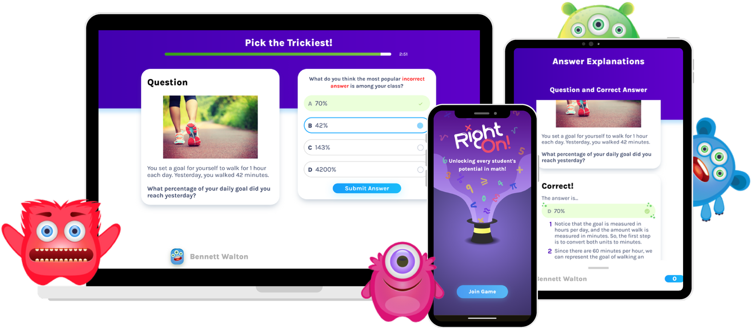
Companion Product Model
RightOn! is interconnected by two apps.
Central, a teacher-facing dashboard for creating or hosting games, and viewing student data.
Play, a student-facing trivia game with two phases.
Phase 1: Students try to answer correctly and then read the following correct answer explanation
Phase 2: Students are challenged to pick the trickiest answer and then read the following incorrect answer explanations. The objective here is for students to learn from math misconceptions and their mistakes.
Initial Classroom Study
1 teacher, 2 class periods (56 students total)
RESEARCH METHOD
Moderated Contextual Inquiry & Survey
OBJECTIVES
Observe how students and teachers use RightOn for their learning and pedagogical goals.
Observe student-teacher interactions
Affinity Diagrams for Observed Behaviors
FINDING #1
Limited Flexibility and Control
Teachers and students lacked the ability to adjust or pause gameplay, making it difficult to support students in real time.
FINDING #2
Text-Heavy Explanations
Lengthy instructions overwhelmed students, often causing them to disengage before interacting meaningfully with the material.
FINDING #3
Classroom Constraints
Physical factors—like shared devices, seating arrangements, and noise levels—impacted students’ ability to fully engage with the app.
Problem Solving Timeline
Based on constraints, we will be scoping our redesign to address Text-Heavy Explanations.
This considers our impact given time, the number of products we want to change, in this case just Play, and research goal as it relates to learning and teaching.
Diving Deeper into Text-Heavy Explanations
“How might we design explanations to be easier for students to digest?”
Reading explanations take effort
“I don’t want to read all of that.”
“I want to see problems or pictures, not words.”
Students answer without thinking
“I don’t know, I just guessed.”
“I‘m confused, what am I suppose to do?”
Teachers direct student focus
“I pay attention or raise my hand when the teacher leads discussion.”
“I didn’t read the explanation until the teacher pointed it out.”
Redesigning the Prototype
Revisiting the Classroom
RESEARCH METHOD
Focus Group Usability Testing, Interviews, & Surveying
OBJECTIVE
Assess how students interact with correct and incorrect answer explanations
Retested with the same 56 students, but this time, distributed students into focus groups of 6 to get a closer look at their behavior.
We also updated the math trivia question to reduce bias since we are using the same group of students.
Student Feedback
-
"It was easier to read the explanations today because there weren't any long paragraphs."
-
"The pictures and the different colors were helpful."
-
"There's less text in it this time and I like it better."
-
"I liked the reveal answer part. It showed us the mistakes."
-
"I liked how I could see what things might be things to avoid in the future for this type of math problem."
-
"It shows you the mistakes that you made. It's helpful."
57% of students reportedly read the correct explanation from Phase 1.
44% of students reportedly read the incorrect explanations from Phase 2.
67% of students indicated that they understood the explanations.
Conclusion
-
Working with a fast-paced team was exciting and pushed me to grow quickly.
One challenge was being comfortable with educational systems. Unlike many of my teammates, I didn’t have a teaching background, so I had to build an understanding of pedagogy, teaching standards, and classroom dynamics from scratch. Over time, this shaped how I approached design—especially in crafting copy that aligns with how students learn and how teachers communicate.
Another challenge was navigating tight and often shifting timelines. Even with a structured plan, new opportunities would emerge unexpectedly, requiring us to adapt quickly. Whether it was conducting onsite research or meeting with advisors, we leveraged AI tools to rapidly design and prototype without relying on developer support, which allowed us to move fast while still producing strong results.
-
With business priorities shifting, the UX team pivoted to another project with the possibility of revisiting unaddressed insights at a later time. If we were to continue, the next steps are as follows:
Refine the prototype given the time-constraint and collaborate with the engineering team for implementation.
Explore teacher-facing features like “Whiteboard Mode” to address limited flexibility, control, and classroom constraints.
Expanding research to more classrooms to discover patterns across diverse learning environments.